Saturday, 18 July 2015

Australian Bureau of Meteorology Station Data Review


In a previous post I described my adventures downloading and converting the Bureau of Meteorology’s (BOM’s) Climate Data Online (CDO) and its Australian Climate Observation Reference Network – Surface Air Temperature (ACORN-SAT) datasets.

The BOM claims “The Australian Climate Observations Reference Network – Surface Air Temperature (ACORN-SAT) dataset has been developed for monitoring climate variability and change in Australia. The dataset employs the latest analysis techniques and takes advantage of newly digitised observational data to provide a daily temperature record over the last 100 years. This data will enable climate researchers to better understand long-term changes in monthly and seasonal climate, as well as changes in day-to-day weather. ”

Another BOM statement is more worrying: “ACORN-SAT is a complete re-analysis of the Australian homogenised temperature database.” The emphasis on ‘re-analysis’ is mine.

As Gary Smith says in his wonderful book, Standard Deviations: Flawed Assumptions, Tortured data and Other Ways to Lie with Statistics, self-selection bias leads researchers to find what they are looking for and to ignore anything that contradicts their pet theories.

In the case of climate change research and temperature records, this may lead researchers to find the past temperatures colder ‘than first thought’ and more recent temperatures warmer. I’m keen to see if there is any evidence of this taking place with Australia’s BOM.

I sincerely hope not.

You may recall from the last post on this topic that the CDO database contains temperature data from 1,871 weather stations from around Australia, dating as far back as1855. There are separate records for maximum and minimum temperatures and to be useful, both maximums and minimums must be available for the periods of time in question.  On this basis, CDO contains data for 1,718 ‘useful’ stations, as I’ve chosen to call them.

The BOM has selected 112 of these stations to form the ACORN-SAT dataset.  Why 112? the BOM explains “The locations are chosen to maximise the length of record and network coverage across the country.” Sounds fair enough, but leaves the question what’s wrong with the others?

BOM Question 1 Is  descriptive data consistent

Note: The black dots are ACORN-SAT stations. The red dots are CDO stations.

While reviewing the documentation associated with the data, I discovered another interesting fact: The 112 ACORN-SAT stations are actually composed of records from 202 CDO weather stations.

Confused?  I was.

Only 38 of the 112 station records are based on a single weather station.  The remaining 74 are composites of the data from 2, 3 or in one case 4 separate weather stations. While there are, no doubt, excellent reasons for doing this it makes before and after adjustment comparisons more difficult.

Even the exact makeup of the composite stations was difficult to clarify.  BOM documents describing the final station makeup gave different results. This crucial information was not available electronically.

Never mind.  I got it in the end.

I’ve compiled an extensive analysis of the station data that’s available as a PDF from the link below.

It’s based on queries of my downloaded database and was analysed with Mathematica. It’s got maps and is pretty self-explanatory, but probably a bit too detailed for some.

Click here to download the PDF file.

There’s one more bit of analysis I intend to do prior to looking at the actual temperature data. In my next post I’ll address the timespan of both the CDO and ACORN-SAT stations. The BOM claims that it picked CDO stations with the longest periods of observation for ACORN-SAT.

We’ll see.

Wednesday, 15 July 2015

New Horizons and silly statements

I was quite excited to see the wonderful images of Pluto taken by NASA’s New Horizon probe.

CJ4QOP6WEAAgqD9

Click here to see the image on NASA's Twitter page

The Australian (my daily paper of choice) carried an article by Michio Kaku of the Wall Street Journal, telling us a little about the mission. Click here to read the original article.

I was intrigued with the headline “Pluto mission New Horizons may save us on Earth”. I was worried that somehow Pluto was going to be related to climate change, but was relieved that the claim was only that knowing more about comets would have saved the dinosaurs.

A bit of a stretch, I thought.

Two sentences in particular caught my eye:

“But first, scientists need to know if it survived the chaotic Kuiper Belt, the region beyond Neptune which Stern has described as a “shooting gallery” of cosmic debris.

NASA expects to receive a signal from the spacecraft later on Tuesday to find out whether or not the spacecraft made it through intact.”

Make it through the Kuiper belt? By Tuesday?  Read about the Kuiper belt by clicking here.

The Kuiper belt is a vast donut shaped area filled with rocks, lumps of ice and other spacecraft hazards.

The entire belt extends from 30 to about 55 AU from the Sun.

An AU or Astronomical Unit is a measure of distance used by astronomers when dealing with Solar System sized distances. It’s the distance from the Sun to the Earth and about 93 million miles or 149.6 million kilometres.

The main part of the belt starts at about 40 AU from the Sun and extends to about 48 AU. That will be the most hazardous part of the journey for New Horizons.

At present, New Horizons (and Pluto) are about 33 AU from the Sun. Click here to see more about New Horizons and Pluto. Its only 2 AU into the belt and is still about 8 AU from the main belt.

At it’s present speed of about 50,000 kilometres per hour, it’ll take 2.4 years for it to reach the start of the main belt, 5.2 years to reach the end of the main belt and 7.6 years to reach the outer edge of the entire Kuiper belt.

To be fair, the writer didn’t say which Tuesday.

He could have meant 395 Tuesdays from now.

Friday, 10 July 2015

Using Australian Bureau of Meteorology data II

Getting ACORN-SAT data from the BOM

In my last post I went through, in some technical detail, how I extracted the Climate Data Online (CDO) data from the Australian Bureau of Meteorology (BOM). Click here to access the BOM CDO data pages.

Today I’ll go through the same process with the Australian Climate Observation Reference Network – Surface Air Temperature dataset.

If you remember, I set out to look at the differences between the raw data (CDO) and the adjusted data (ACORN-SAT) that have generated considerable controversy and a government inquiry into the behaviour of the BOM.

Click here to access BOM's ACORN-SAT page.

A quick look at the ACORN-SAT page made my antennae twitch:

“ACORN-SAT is a complete re-analysis of the Australian homogenised temperature database.”

I’m hoping that’s not BOM-speak for “the previous temperature database didn’t support our view on global warming so we ‘re-analysed’ it”.

I also noticed that no station data prior to 1910 are available.  Remember last time, I mentioned the hot 1890s? But I’m getting ahead of myself.

BOM ACORN-SAT station list

The page has a link for a “Sortable list of ACORN-SAT stations with linked data. Through a process called ‘screen scraping’ I was able to just select all of the entries in the table, drop it into Excel, save the worksheet and import it into SQL Server. For the next step I also save the spreadsheet as a CSV file to make it easier to access in my conversion program

So far, so good.

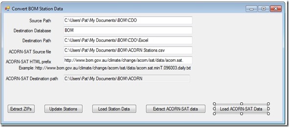
The next step was to add two more functions to my conversion program. The second button from the right reads the CSV version of the spreadsheet, looping through the stations. As the screenshot above shows, the minimum and maximum temperature data are hyperlinks.  They’re actually hyperlinks to the text files containing the data.Convert BOM data

My program uses the link to download the data and store it in a text file on my laptop.

The rightmost button loops through the 244 files I’ve downloaded, does some error checking, then stores the data in the SQL Server database. The data is a record for each station for each day of each year giving the minimum or maximum temperature.

There’s one odd thing I noticed right away. When no data is available for a particular station for a particular day, instead of leaving it out, the BOM has used a ‘dummy value of 99999.9 degrees Celsius. Talk about global warming! Imagine using that value in a calculation.

Just for fun, I calculated the average for station 10092 (Merredin, Western Australia) using the dummy value. I know WA is hot, but an average temperature if 1,634 degrees Celsius seems a bit excessive.

I know the value shouldn’t be actually used, but leaving the record out or using a standard value like NULL is preferable an removes the chance of an error like this creeping into a calculation.

Using NULL instead of 99999.9 gave the more realistic (and correct) average temperature of 24.8 degrees.

For readers unfamiliar with database technology, using the NULL value for calculating the average does three important things:

  1. It clearly marks the record as having missing data.
  2. When computing the sum, this record is skipped.
  3. When dividing the sum by the number of records, the number of records is adjusted as well.

Using a dummy number like the BOM has done is 1960s style data handing practice and should definitely be a no-no in 2015.

I’ve changed the 99999.9s to NULLs in my copy of the database.

I completed the initial database build and found 3,635,866 minimum temperature records of the expected 112 sites and 3,635,933 maximum temperature records for the same 112 sites.

Some of the initial questions that occur to me, that I intend to explore include:

  • Why is the number maximum temperature records different from the number of minimum temperature records?
  • Why were just these 112 sites out of a possible 1871 chosen?
  • How different is each ACORN-SAT site from its CDO equivalent?
  • Exactly what adjustments were made?
  • How are the adjustment justified?
  • How were the adjustments made?
  • What are the uncertainties in these measurements?
  • How different are the trends indicated by each dataset?

I will welcome any additional suggestions from anyone who happens to follow this blog. I’m also happy to make details of the source code and scripts used in the compilation of this database. I’m happy to make the database itself available more generally, subject to any copyright restrictions that may exist.  I’ll look at that issue more closely.

In my next post I’ll report on my initial look at the data.

Using Australian Bureau of Meteorology data

Overview

As I discussed in my last post, I’ve decided to have a look at the climate data managed by the Australian Bureau of Meteorology (BOM).

I specifically want to look at two aspects:

  1. How different are the raw and adjusted data sets?
  2. What mechanism are used to adjust the data?

I’ve decided to limit my investigation to temperature data. The argument’s about global warming isn’t it?

Accessing the data

The BOM maintains two main temperature data sets. 

The raw, unadjusted data is available through a system call Climate Data Online or CDO. Click here to look at the BOM's Climate Data Online

The second has the catchy name ACORN-SAT that has nothing to do with oak trees or satellites. Of course, it stands for ‘Australian Climate Observations Reference Network – Surface Air Temperature’. It contains the adjusted, homogenised temperature records. Click here to view the ACORN-SAT page at BOM.

Getting CDO data

After poking around the CDO pages for a while I came to a few disturbing realisations.

  • The are not records for daily average temperatures. Remember that argument goes that the polar bears need sun block because the average temperature of the Earth is rising and it’s all our fault for burning fossil fuels. The BOM does not provide this data. Instead, it provides two separate sets of data: one for daily high temperatures and a separate one for daily low temperatures. I’ll assume the average is the sum of the high and low temperatures divided by two. I have computers.  I can do this.
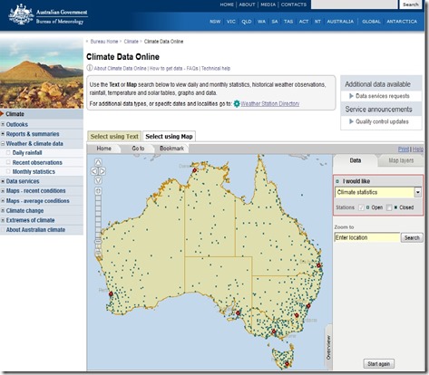
  • I can only get the data for one weather station at a time. I have a choice between a cute map with dots for each weather station. If I click on a dot, I can get either the maximum or minimum temperatures for tat station for every day the station’s been in service.

BOM CDO map 

  • Fortunately, there’s a Weather Station Directory. Unfortunately, it lists 1,817 separate weather station, including several in Antarctica, Vanuatu and other islands around Australia.
  • My other download choice is to enter a station number from the Directory and get the data that way. At one per minute, that’s around 30 hours for the minimum temperatures and another 30 hours for the maximum temperatures. At age 67, that’s too much of my remaining life expectancy.
  • Once I’ve selected the data, I can download a ZIP file with all of the data in a Excel style comma separated value (CSV) file and a text file containing explanatory notes with things like the stations height above sea level, the state within Australia it’s in and the column layout of the CSV file.
  • Each file has to be unzipped to extract these file. Then the individual CSV file need to be combined.

Fortunately, I’m a nerd and know several programing languages. After some mucking around I made and implemented the following decisions:

  • I decided to put all of the data into a Microsoft SQL Server database. I’ve used this database, along with Access, Oracle, MySQL and others for various projects and tasks over the years and am quite comfortable with it.
  • I’ll use Wolfram Mathematica for producing graphs and any complex calculations. No special reason other than I LOVE Mathematica.
  • After downloading the Weather Station Directory, I used the SQL Server Import Wizard to load the directory into a SQL Server database I’ve created.
  • I used a wonderful tool called iMacros to automate the download process. iMacros allowed me to create a separate CSV file with just the station ID numbers and feed it to a script that mimics the mouse clicks necessary to actually do the download. During the process Firefox, my web browser of choice crashed out a few times so the whole download process happened over about an eight hour period. Fortunately, there was little human intervention required other than restarting Firefox and cutting the station numbers that had already been downloaded out of the iMacros datasource CSV file.
  • At the end of the process I had 3,465 files, somewhat less than the expected 3,634 files. I noticed while watching the process that sometimes either the minimum or maximum temperature data was not available for a particular weather station. I paused to ponder why a weather station wouldn’t record the minimum and maximum temperature. I failed to come up with an answer. It’s a weather station for heavens sake. What’s it there for if not to record the temperature?
  • The next problem I faced, of course, was how to unzip 3,465 separate files. Fortunately, I use VB.NET as my primary development environment for commercial application. There’s a Windows component called Shell2 that allows extraction of files from zip archives. (Feel free to skip ahead if you feel your eyes glazing over. I’m recording this for other nerds who may wish to replicate my process. Feel free to post a comment if you want to request copies of my scripts and/or source code.)
  • A few hours later, I had 6,390 files: 3645, text files and 3,645 CSV files with station data. In order to limit future analysis to mainland Australia, I was keen to add the state to the weather station table in the database. I also thought the elevation (height above sea level) might be useful too. Also, I wanted to look through the column definitions to make sure all the CSV files had the same layout.
  • I modified the VB.NET program to read all of the text files, extract the state and elevation, update the weather stations table and check the layouts. While I was at it, I added the name of the notes files for each station to the station table.  That way I have a method of telling which stations are missing temperature data. I’ll use only stations that have both sets of data.
  • Now the only task was to actually load the CSV files into the database. Unfortunately the SQL Server Import Wizard isn’t made to load 6,930 files all at once. Another hour or two in VB.net added that functionality. Actual runtime was many hours, so I left it running overnight and went for a beer with a friend.
  • Next morning I found I had a total of 16,999,270 minimum temperature records and 17,245,194 maximum temperature records.
  • Total elapsed time was three and one half days. Total effort, about two days, maybe a bit less. I also required the use of a range of specialist tools that I happen to have at hand due to my profession. I also am less that flat out with paid work so I could afford to put in the time.
  • The next steps involve performing a similar, but different set of extractions and imports of the ACORN-SAT data. Fortunately, there are only 120 of them. This raises the question of why, if Australia has aver 1800 weather stations, the BOM uses data from just 120 of them.

The BOM’s facility for accessing Climate Data Online works, no doubt about that. My previous concern that it was designed to confuse rather than enlighten is, unfortunately confirmed.

My next post will take you through the ACORN-SAT process.  Then we can get on with looking at the original questions of “why the adjustments” and “how are the adjustments made?”

I’ll finish with a view of my first attempt at generating a map with Mathematica. It shows a map of Australia and surrounds with a red dot at the location of each weather station.


Map of Oz weather stations

I’ve cropped lots of the outlying stations like those in Antarctica.

Not bad for a first effort, if I say so myself!

Thursday, 9 July 2015

Australia’s temperature history

The BOM

Temperature records in Australia are kept by the Australian Bureau of Meteorology, commonly abbreviated the BOM. They provide a range of invaluable weather services like daily temperature forecasts, rain forecasts and storm warnings.

Click here to visit the BOM's web site.

BOM Home

One of my favourite features is the rain radar. Before a storm it’s possible to see the direction and intensity of rain in real time.

BOM radar

This picture shows a rain band extending from Cape Liptrap in Victoria, across Bass Strait, to an area between St. Helens and Launceston in Tasmania.

There’s also scraps of rain off Ulladulla and Sydney in southern New South Wales.

The BOM’s is a vital source of weather information for all Australians.

Climate data and controversy

Believe is or not, the BOM has recently been embroiled in a controversy and has been the subject of a government inquiry. The Australian featured the story below of how the ‘homogenised’ temperature records and other adjustments made by the Bureau appeared to have been done to support the hypothesis of human-induced global warming.

Bureau of Meteorology ‘altering climate figures’

Environment Editor

Sydney
BOM Story, The Australian August 2014

Researcher Jennifer Marohasy has claimed the Bureau of Meteorology’s adjusted temperature records resemble ‘propaganda’ rather than science. Source: News Corp Australia

THE Bureau of Meteorology has been accused of manipulating historic temperature records to fit a predetermined view of global warming.

Researcher Jennifer Marohasy claims the adjusted records resemble “propaganda” rather than science.

Dr Marohasy has analysed the raw data from dozens of locations across Australia and matched it against the new data used by BOM showing that temperatures were progressively warming.

In many cases, Dr Marohasy said, temperature trends had changed from slight cooling to dramatic warming over 100 years.

BOM has rejected Dr Marohasy’s claims and said the agency had used world’s best practice and a peer reviewed process to modify the physical temperature records that had been recorded at weather stations across the country.

It said data from a selection of weather stations underwent a process known as “homogenisation” to correct for anomalies. It was “very unlikely” that data homogenisation impacted on the empirical outlooks.

In a statement to The Weekend Australian BOM said the bulk of the scientific literature did not support the view that data homogenisation resulted in “diminished physical veracity in any particular climate data set’’.

Historical data was homogenised to account for a wide range of non-climate related influences such as the type of instrument used, choice of calibration or enclosure and where it was located.

“All of these elements are subject to change over a period of 100 years, and such non-climate ­related changes need to be ­accounted for in the data for ­reliable analysis and monitoring of trends,’’ BOM said.

Account is also taken of temperature recordings from nearby stations. It took “a great deal of care with the climate record, and understands the importance of scientific integrity”.

Dr Marohasy said she had found examples where there had been no change in instrumentation or siting and no inconsistency with nearby stations but there had been a dramatic change in temperature trend towards warming after homogenisation.

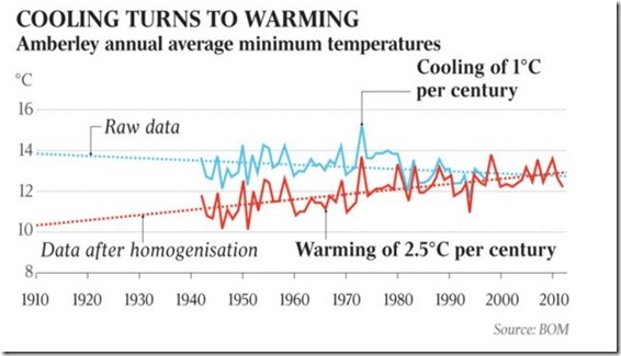
She said that at Amberley in Queensland, homogenisation had resulted in a change in the temperature trend from one of cooling to dramatic warming.

She calculated homogenisation had changed a cooling trend in the minimum temperature of 1C per century at Amberley into a warming trend of 2.5C. This was despite there being no change in location or instrumentation.

BOM said the adjustment to the minimums at Amberley was identified through “neighbour comparisons”. It said the level of confidence was very high because of the large number of stations in the region. There were examples where homogenisation had resulted in a weaker warming trend.


You can visit Dr. Marohasy's web site by clicking here. 

The BOM under investigation

In January 2015 the Parliamentary Secretary for the Environment, Bob Baldwin, appointed a Technical Advisory Forum on Climate Records to review the Bureau’s practices. You can see Mr. Baldwin's press release, the forum's terms of reference and its membership by clicking here.

The Forum delivered their report in June 2015. It was not very startling, but they did make several recommendations.

These are, in brief:

  1. Improve communications about climate data, specifically uncertainties, statistical methods and adjustments.
  2. Improve accessibility to both raw and adjusted climate data. I’ll have more to say about this in my next post where I’ll detail the hoops I had to jump through to access the data.
  3. Improve the statistical methods used in determining which records require adjusting.
  4. Improve the handling of metadata. Metadata includes non-climate data like the history of movements of weather stations or instrumental changes.
  5. Expand the range of data included. The BOM does not include data prior to 1910. In fact it has records dating back to 1855. The 1890s were particularly hot in Australia. A cynical, sceptical person might say the older records have been excluded because they make a nonsense of statements of recent years being the ‘hottest on record’.

The BOM has been accused of other tampering:

Cyclone Marcia made landfall near Rockhampton Queensland in February 2015. The Bureau claimed in its press release that Marcia had reached Category 5. A Category 5 cyclone corresponds to a Category 12 hurricane on the Beaufort Scale used in other parts of the world. You can read about the Bureau's Categories here.

The highest wind speed recorded of 208 kilometres per hour and the lowest measured barometric pressure of 972-975 hectopascals means the cyclone was of Category 2. Still serious, still dangerous, but not out of the ordinary.

The Bureau appeared to be more interested in scary headlines than accuracy.

Just last week, a Bureau representative claimed ““We’ve never had a July tropical cyclone in the Queensland region before.” when quizzed about a weak cyclone forming near the Solomon Islands. The bureau representative ‘forgot’ about July cyclones in 1935, 1954 and 1962.

What has driven me to look at the Bureau’s data myself is a claim by Lance Pidgeon that the Bureau reports that the highest maximum temperature in Eucla on the the Nullarbor in South Australia for the month of December 1931 was less than 36 degrees Celsius, but the average was more than 36 degrees. This is, of course, a mathematical impossibility.

So, I’ve embarked on a project to download the various BOM databases, examine both the raw and adjusted records and come to my own conclusions about the Bureau’s processes.

My experience so far? While the data appears to be available, it’s in a form designed to confuse rather than enlighten. I’ll deal with some details in my next post.

An organisation like the Australian Bureau of Meteorology performs vital services for Australians. Its value is, of course, highly dependant on its trustworthiness.

For example, if it were to issue flood warnings every time it predicted rain, people would soon ignore flood warnings, with potentially lethal consequences.

We understand predicting the weather is an inexact science and are tolerant, if somewhat scathing, when a prediction turns out to be wrong.

There appears to be some evidence that the Bureau is misusing its position of trust to exaggerate climate events like temperature rise and severe storms to support the political, not scientific, dangerous global warming agenda.

Even ten year ago, the idea of a government inquiry into an organisation like the Bureau of Meteorology would have been unthinkable. Even more unthinkable would be the idea of the Bureau ‘adjusting’ temperature records to support a political cause.

Unfortunately, the unthinkable has become cause for grave concern.